

Implementation references
Scripting API and implementation references.
UI Toolkit
IMGUI
Overview
- Foldouts hide and display content in a box that can be expanded and collapsed
- Foldouts allow the grouping of interfaces and elements into a compact space
- Due to their collapsing and expanding behavior, a foldout is sometimes referred to as an “accordion” or an “expandable box”
Foldout APIs
Foldouts in UI Toolkit
Guidance
When to use
Use a foldout for grouping together a small number of items in a box that can be hidden by collapsing or revealed by expanding.
Choosing between foldout, list, and tree view
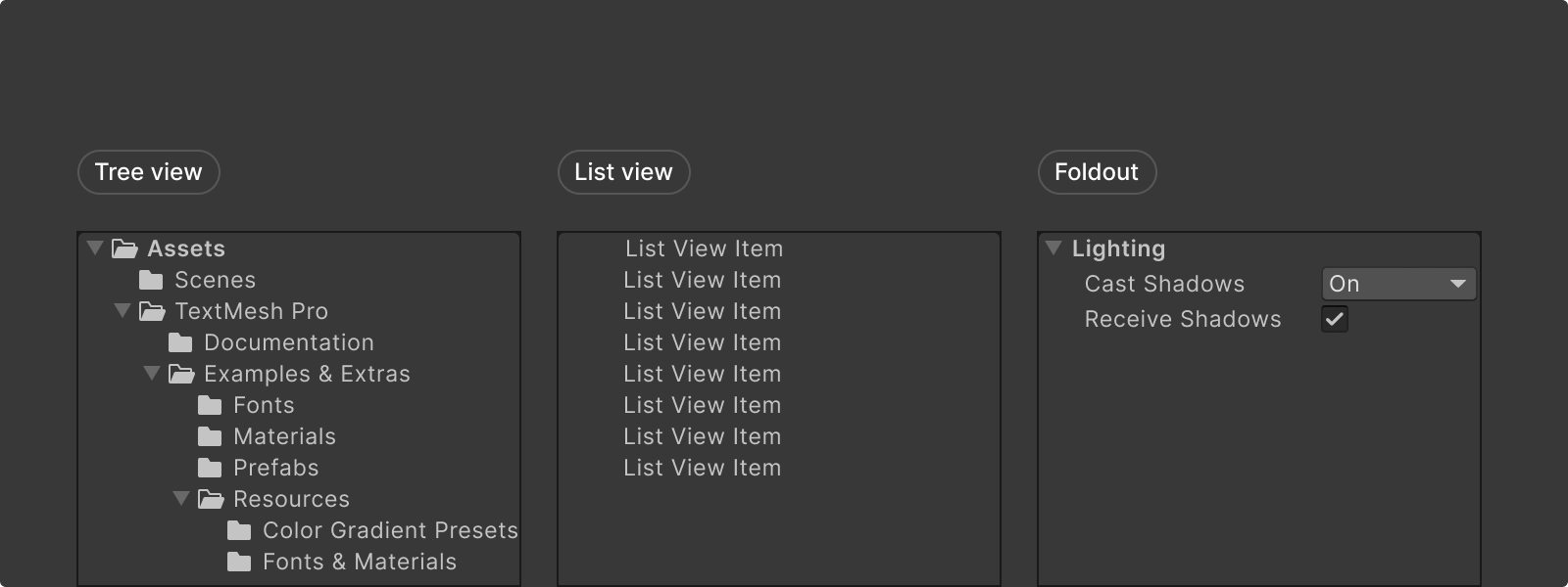
- Tree view is used for displaying items in a multi-tiered hierarchy, like a folder structure
- List view is used for displaying items as a flat list
- Foldout is used to expand or collapse a single level of mixed content, like Inspector controls
Style
Foldout content
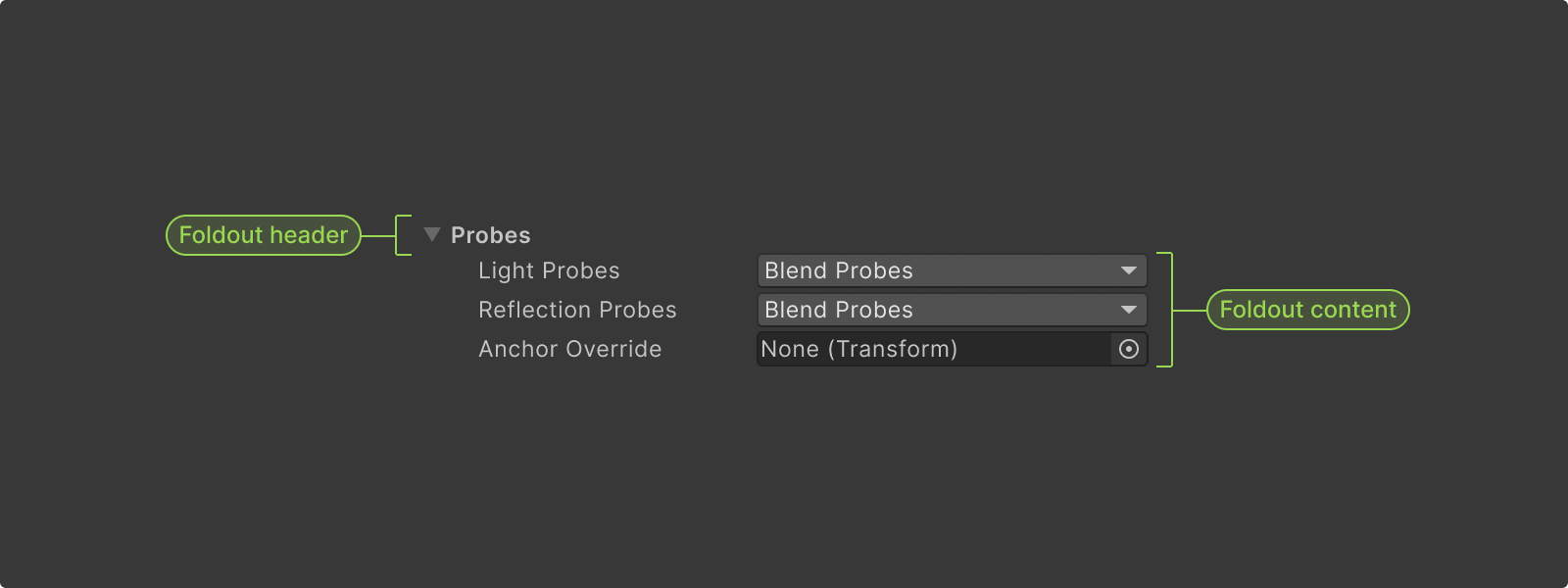
Header
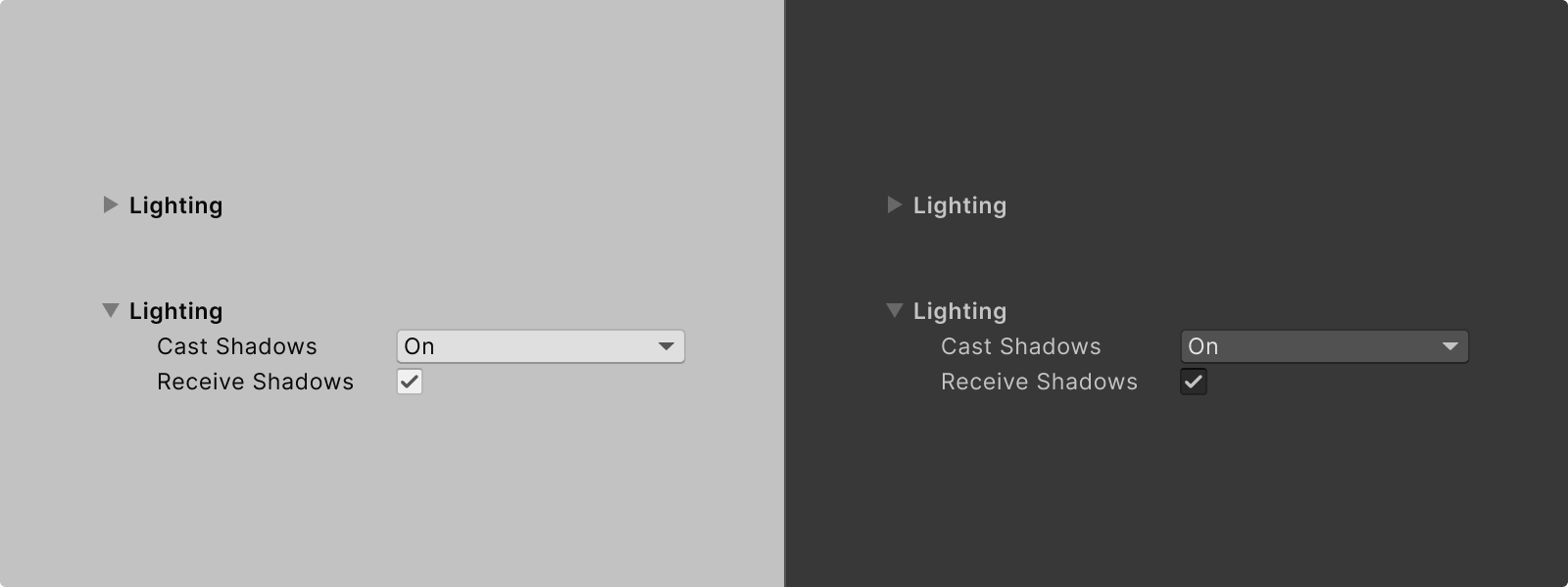
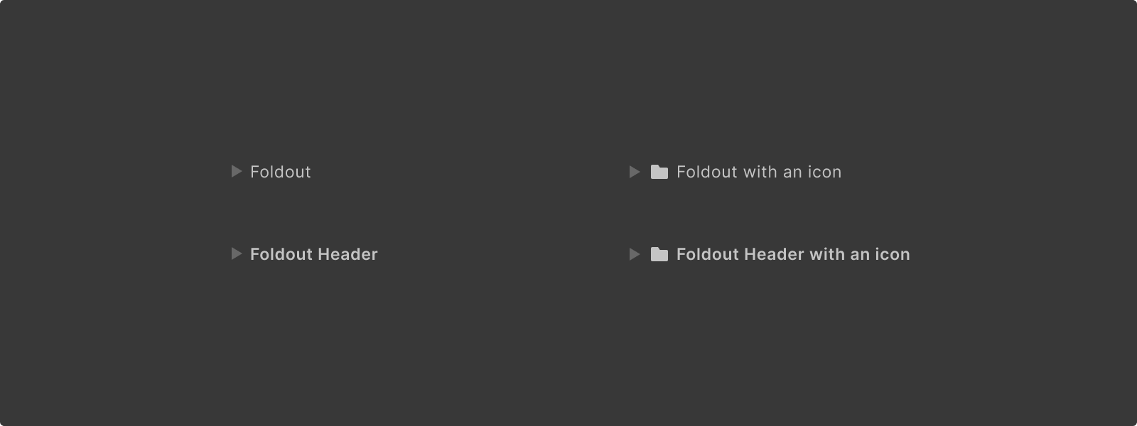
- Foldout headers always have a foldout arrow and a foldout label
- Foldout labels can be bold to build hierarchy between nested foldouts
- In some instances foldouts can have an icon (as seen in the tree view of the project window)
Content — Any content can be placed in Foldouts.
- Foldouts can have lists and appear in menus to help stratify domains
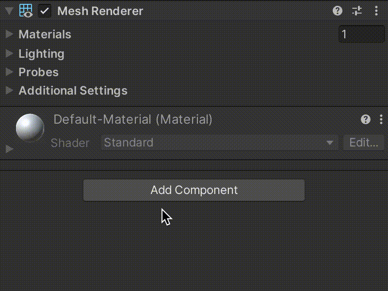
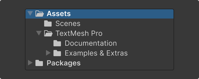
- Foldouts can be used to divide an interface into specialized sections or individual processes (as seen in the Inspector’s components)
- Some foldouts contain items which affect other areas of an interface as seen in the nested folder foldouts of the project window which change which folder’s contents are being displayed
Foldout indentation and nesting
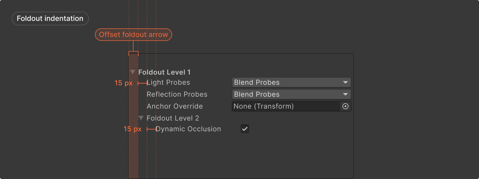
- Foldout content is indented 15 pixels for each nested level
- The nested foldout limit is six items; beyond that the 15 px indentation padding is not adjusted
- The foldout arrow is rendered offset from the content area
Behavior
Expand and collapse
- When used in tree views (e.g. hierarchy, project view), clicking on the foldout arrow should expand the foldout, and clicking on the foldout text should select the tree view element
- When using foldouts for other cases (e.g. Inspector properties) clicking on either the foldout arrow or the foldout text should expand the foldout
Scrolling content
If Foldout contents are longer than its window scroll view should be used to allow for vertical scrolling.
Formatting
Anatomy and layout
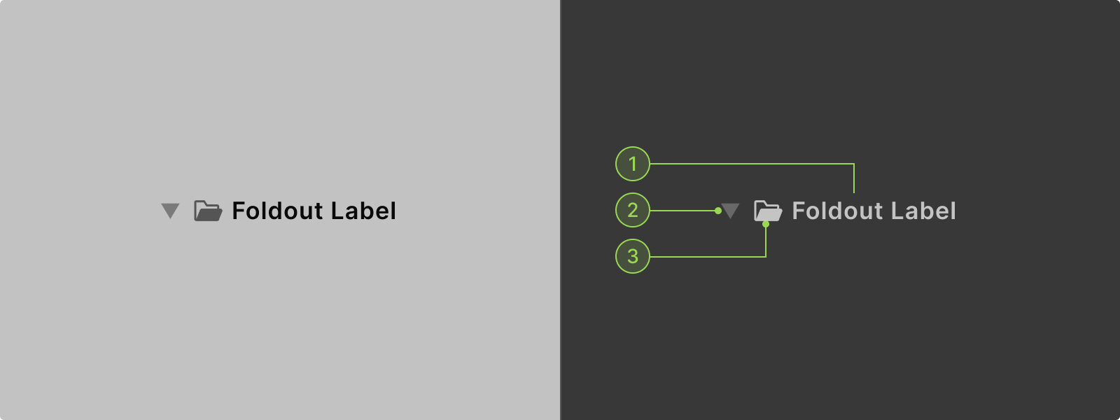
Anatomy
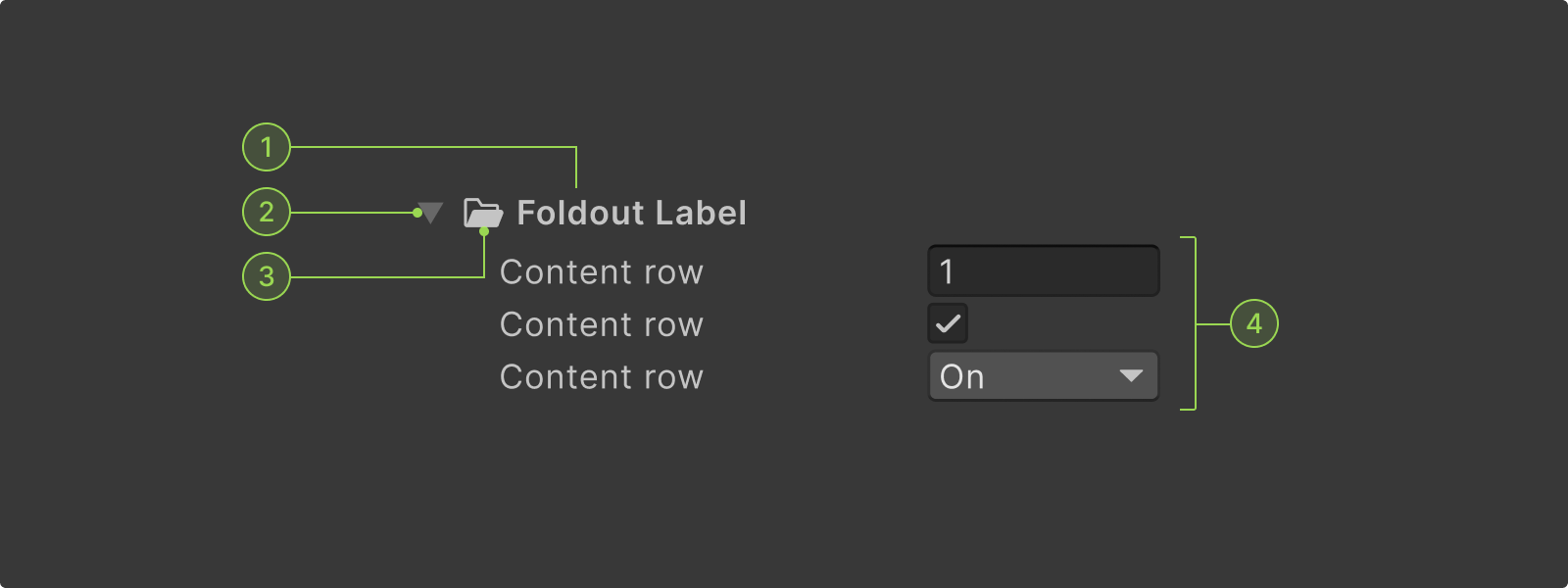
A numeric field can contain and be paired with the following elements:
1. Foldout arrow
2. Foldout icon
3. Foldout label
4. Content
1. Foldout arrow
Arrow icon to expand and collapse foldout.
2. Foldout icon
Icon of the foldout item.
3. Foldout label
Label of the foldout item.
4. Content
Any type of control can be placed in foldouts.
Interaction states
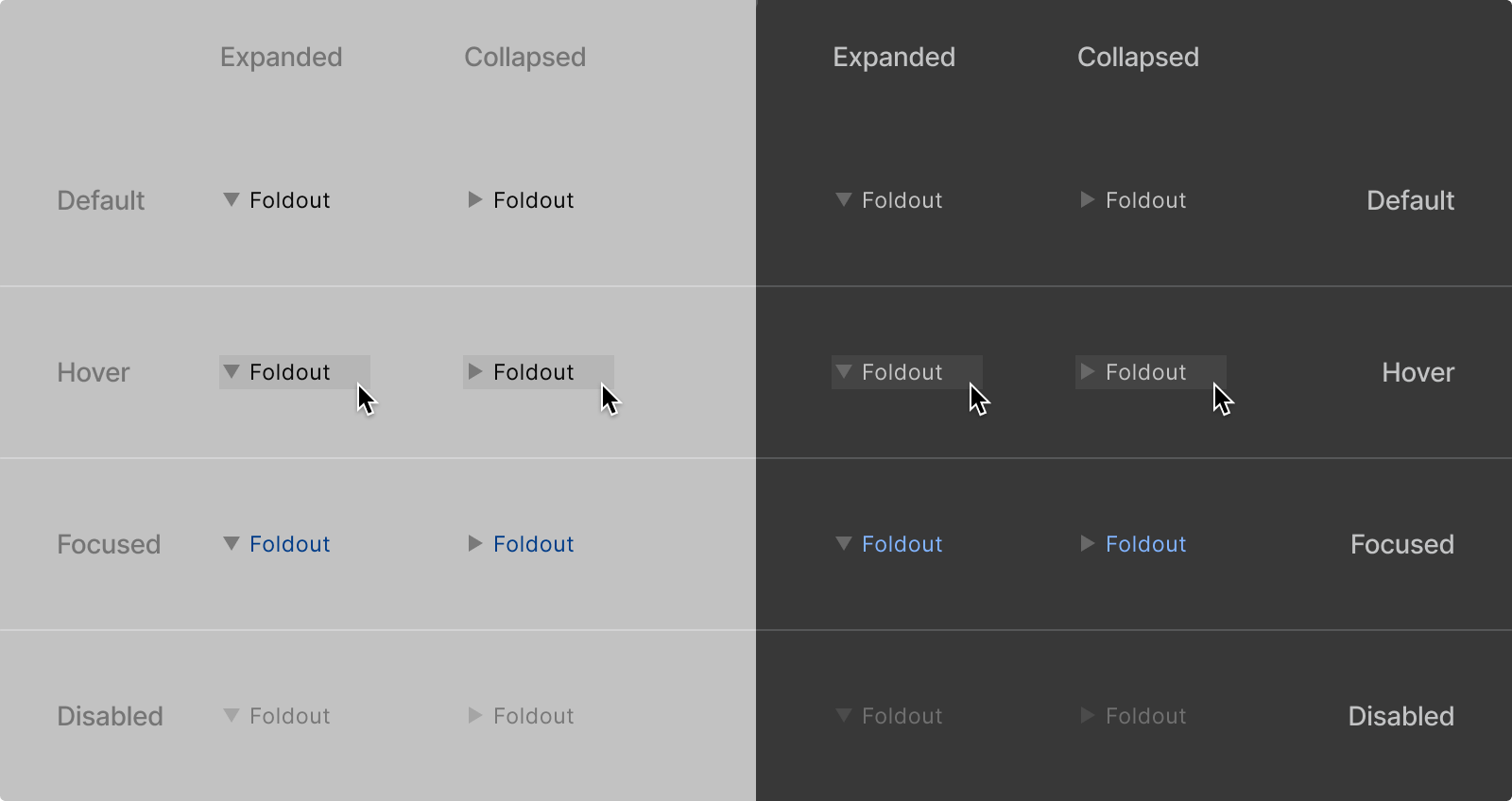
Expanded
An open foldout displaying its contents.
Collapsed
A collapsed foldout.
Default
Default state of foldout.
Hovered
When hovered foldout rows are highlighted.
Focused
When focused foldout labels are highlighted in blue.
Disabled
Disabled foldouts.
Color
1. Foldout label
2. Foldout arrow
3. icon
Code references
Scripting references for
UI Toolkit
Unity - Scripting API:
Foldout
Scripting references for
IMGUI
Unity - Scripting API:
EditorGUI.Foldout
Resources & Related


