
Overview

- Help boxes are used to alert the user of an event in a specific section of an Editor window, such as a property setting
- They appear below the affected area (for example a property in the Inspector window)
- Help boxes shift the content below it
Help box APIs
Guidance
When to use
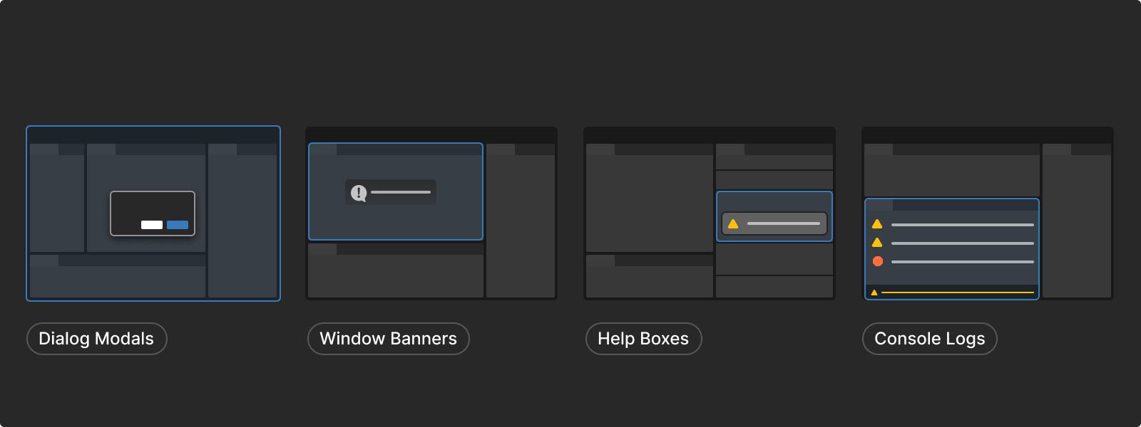
Consider the following criteria to decide when to use help boxes or other feedback options:
- If the message is about a property or a control in the window, use a help box
- If the message is operational to the Editor, it should be logged as a console log
- If the message prevents the user from continuing until a choice or an action is made, use dialogs
- If the message is a confirmation or an acknowledgment that requires minimal user interaction, use a window banner
Message types
Error messages

- Indicates a function will not complete an action
- Use errors for situations where the Editor can not recover or proceed gracefully
- Error messages in the console are themed red
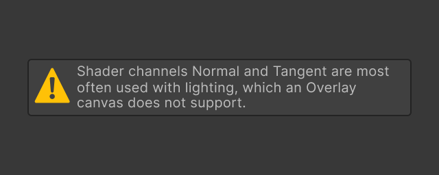
Warning messages
- Indicates a function that will complete an action but may return results that are not what the user intended
- Use warnings for situations where the Editor can recover/proceed, but users may be unaware of the side effects
- Warning messages in the console are themed yellow
Informational (log) messages

- Used for communicating non-critical information
- Can provide helpful advice that is not essential to the operation
- Shares similarities to tooltips
- Sometimes referred to as a log message
Content best practices
Well written alert messages should be:
Human-readable
Messages should use the plainest possible language that can clearly convey the message. Avoid obscure codes, abbreviations, or technical jargon. Ideally, a beginner-level user of the feature should be able to understand the alert message.
Concise
Only include the information the user needs to understand and resolve the immediate problem.
Polite
Alert messages should not be written in a negative voice that blames users for incorrect usage but in a positive or neutral voice. Avoid phrases like "illegal command".
Do include any phrasing that specifically relates to that error so users can look up that exact problem on a search engine using precise wording
Do not use vague wording such as "syntax error"
Do not begin the error or warning message with “Error” or “Warning” as the color styling and associated icon makes this wording redundant
Formatting
Anatomy and positioning
Anatomy
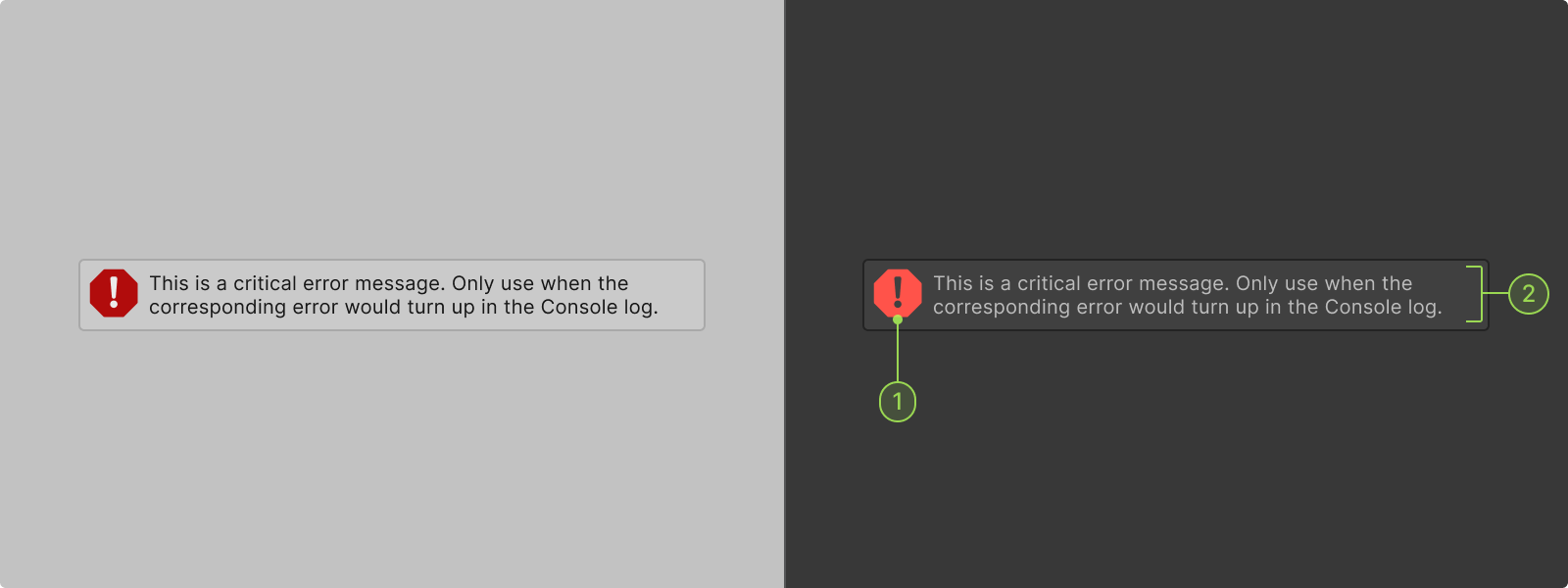
A help box contains the following elements:
1. Message icon
2. Message text
Positioning
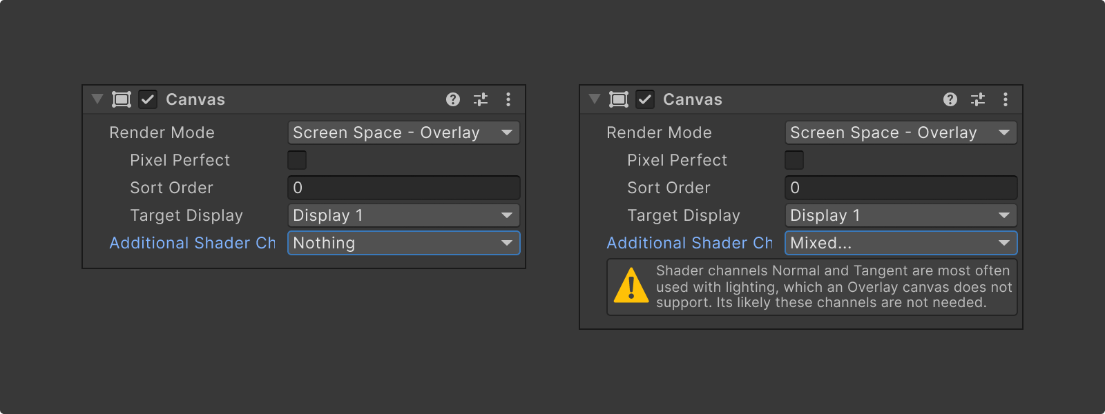
Help boxes appear below the affected area (for example a property in the Inspector window) and shift the content below it.
Interaction states
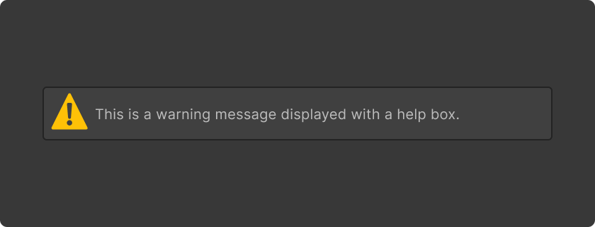
Default
Default state of a help box.
Focus
Use canGrabFocus method if the help box can be focused.
Color

Help box colors
Feedback icon colors
Status message text colors
Code samples
Code references
Scripting references for
UI Toolkit
Unity - Scripting API:
HelpBox
Scripting references for
IMGUI
Unity - Scripting API:
EditorGUI.HelpBox
Resources and related


