
Implementation references
Scripting API and implementation references.
UI Toolkit
IMGUI
Overview

Unity Editor contains four types of search fields:
- A search field is an input field that allows users to enter a text string to be searched for
- The search field enables a query of a database, program or search engine
- The search function allows users to quickly locate desired information instead of manually exploring the platform to find information
Basic search field variations
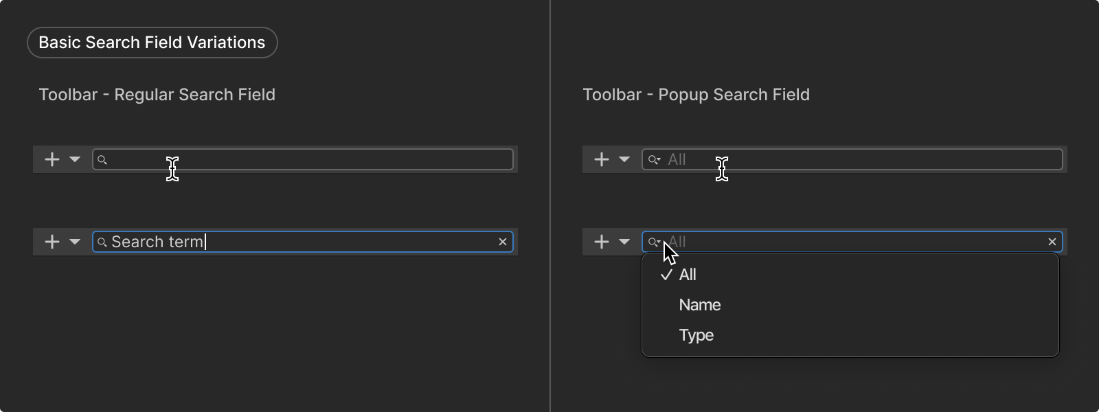
Toolbar - regular search field

When to use
A toolbar search field is an input field in toolbars that allows users to enter text to be searched for.
API in
IMGUI
Field

When to use
A toolbar search field with a pop-up (dropdown menu) used for filtering search queries.
API in
IMGUI
Field
Guidance
When to use
- Use a Toolbar Search Field to enable users quickly locate an Asset or a Scene Object
- If the search query of the database (Asset Library / Scene Objects) needs to be categorized by type, use a Toolbar Pop-up Search Field
When to use a condensed search field
- Use a Condensed Search Field to simplify the UI when search is not the primary functionality in the area
- The Condensed Search Field usually reduces discoverability of the search functionality compared to the regular search field: consider whether this reduced discoverability is worth the trade-off for a more simplified UI
Style
Search fields appear in toolbars and follow the same principles as other toolbar controls.
Length of field

Recommended minimum width:
To allow for legible user input, the recommended minimum width for search fields are 150 px, or 20 characters.
Condensed search field styling
The Condensed Search Field in its collapsed state adapts its styling to the context in which it appears, matching the appearance of other icon buttons in the area.
Behavior
Search results
Search results of a query is displayed immediately while a user is typing.
Search filters
Toolbar Pop-up Search Fields allows users to set object type filters for their search query with a dropdown menu.
Expand and collapse
In its collapsed state, the Condensed Search Field appears as an icon button with a search icon. Clicking on the search button expands the Condensed Search Field into a Regular Search Field and a collapse button, and automatically places focus on the Search Field.
Clicking on the collapse button collapses the Condensed Search Field back into its collapsed state. If the Search Field is empty, clicking outside of the Search Field removes focus from it and automatically collapses it. If there is input in the Search Field, clicking outside of the Search Field does not automatically collapse it.
Formatting
Anatomy and layout
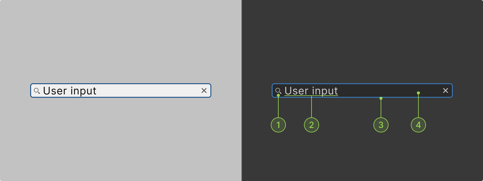
Anatomy

A search field can contain following elements:
1. Search / popup search icons
2. Clear icon
3. Body (container)
4. User input
5. Filter label (popup search fields)
6. Popup menu
7. Condensed search button
8. Collapse button
1. Search / Popup search icons
Pop-up search icon is used to open the dropdown menu.
2. Clear icon
Used to clear user input.
3. Body (container)
The body of the search field is the container where content (Icons, User input, Filter label) is displayed.
4. User input
The search query input by the user inside the search field.
5. Filter label
Label of the selected filter in pop up search fields.
6. Pop-up menu
7. Condensed search button
Condensed state of the Condensed Search Field appears as an icon button.
8. Collapse button
Collapse button used to collapse a Condensed Search Field from its expanded state.
Interaction states
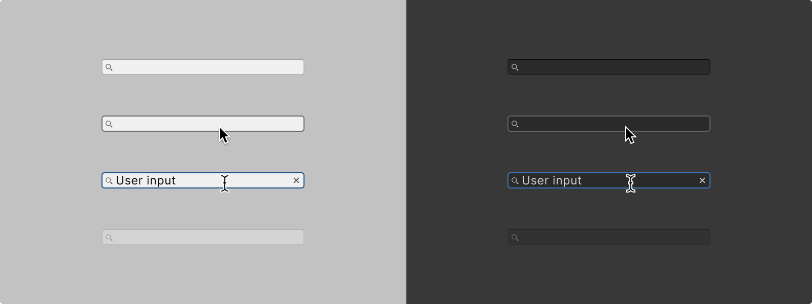
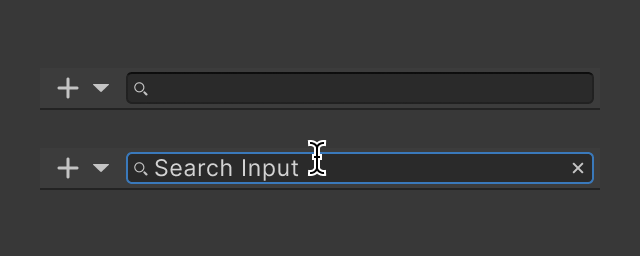
Default
Default state of a Search Field.
Hover
When hovering over a search field body the border will be highlighted. Additionally, the user’s default cursor will switch to a Line Cursor glyph to indicate the nature of the element.
Focused
When a search field enters the Focused state its content will be highlighted in addition to its borders. This is because the content is being selected, allowing for the user to interact with it immediately (for example by immediately deleting or copying all of it).
For the Condensed Search Field, placeholder text inside the Search Field should stay in the field upon user focus, only disappearing upon user input. This enables the user to see the placeholder text even when the expansion of the Search Field automatically places focus on it.
Disabled
A search field that is disabled will indicate so by having its body “greyed out” and will not accept inputs or react to hovering.
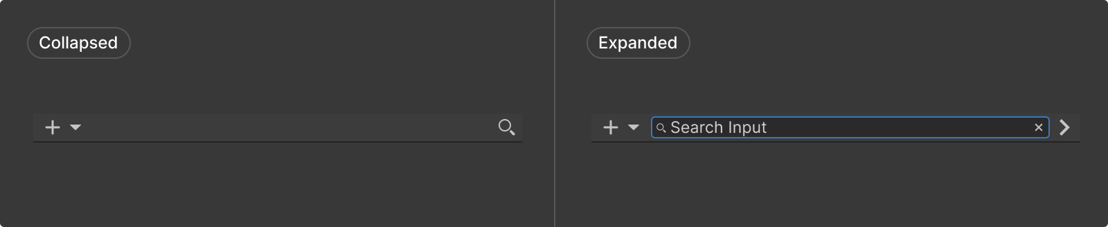
Collapsed
A collapsed Condensed Search Field appears as a search icon button.
Expanded
A search field that is disabled will indicate so by having its body “greyed out” and will not accept inputs or react to hovering.
Color
1. icon
2. text
3. input_field-border
4. input_field-background
Code samples
UI Toolkit samples
Go to Window > UI Toolkit > Samples, to view code samples in C# / USS / UXML.
Code references
Scripting references for
UI Toolkit
Unity - Scripting API:
ToolbarSearchField
Unity - Scripting API:
ToolbarPopupSearchField
Scripting references for
IMGUI
Resources and related


