

Implementation references
An overview of implementation references.
Overview

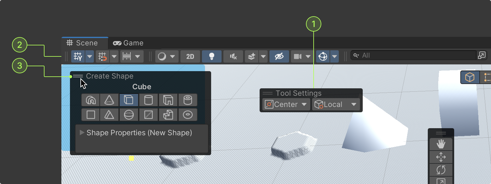
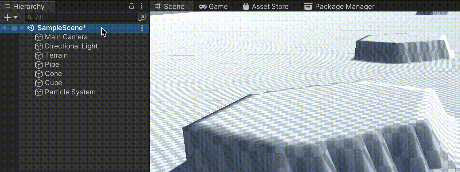
Overlays can be used to display edit modes, tools, and tool settings on top of the windows they are used in, such as scene tools in the scene view window.
They are displayed as floating translucent containers that allow users to access contextual controls while maintaining background visibility.
- Overlays are floating containers that can be implemented in any window in the scene view
- Overlays give windows an additional layer of tools, modes, or actions
- Overlays improve UI consistency and ease of use by making contextual actions conveniently available
Overlay examples
Overlays can be found on / used with;
- Scene transform tools
- View modes
- Grid and snap options
- Scene tool settings
- Particle system (transient)
- Main camera (transient)
- ProBuilder (Package)
Anatomy
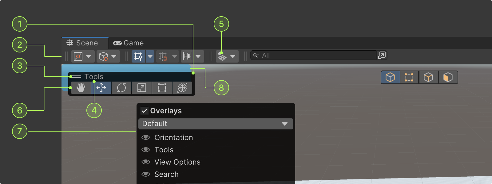
The various elements of overlays include:
- Overlay container: A container that holds the overlay header and contents
- Toolbar overlay container: These containers provide a base for overlays that can be docked in horizontal or vertical edges
- Dragger: Icon in overlay headers that allows dragging
- Overlay label: Name of overlay used as title
- Overlay icon (optional): Overlay icon that will be displayed in horizontal and vertical layouts
- Overlay content: The control elements within overlays
- Overlay menu: The contextual menu that shows overlay options
- Drop zones: Drop zones are blue areas that appear as a container is being dragged to highlight where the container can be docked, and where the container was moved from
For more information go to drop zone color overlays ->
Overlay content
The controls that can be placed in overlays are the same as their equivalent in UI Toolkitbut inherit some overlay functionalities (like collapse state, orientation, and panel).
These elements require specific styling, so it is recommended they inherit one of the predefined EditorToolbartypes, such as:
- EditorToolbarButton
- EditorToolbarDropdown
- EditorToolbarDropdownToggle
- EditorToolbarToggle
For information about how to style overlay content go to the Unity manual ->
Positioning and docking
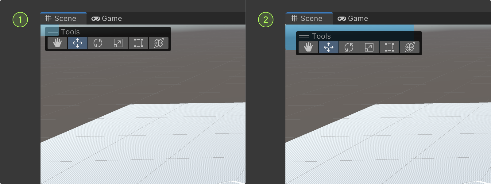
Overlays can float freely or be dragged to dock on the edges or corner of their parent windows. A container’s position is adjusted by using the dragger.
- Floating: Overlay containers can float anywhere on their parent window. Floating containers can be displayed in any layout mode.
- Edge docking: Overlay containers can be docked on the edges of their parent window where the edge drop zones appear when dragging. Once docked, they are displayed in horizontal or vertical layout mode in a toolbar overlay container along the edge.
- Corner docking: Overlay containers can be docked in the corner of their parent windows where the corner drop zones appear when dragging. Corner docked containers can be displayed in any layout mode.
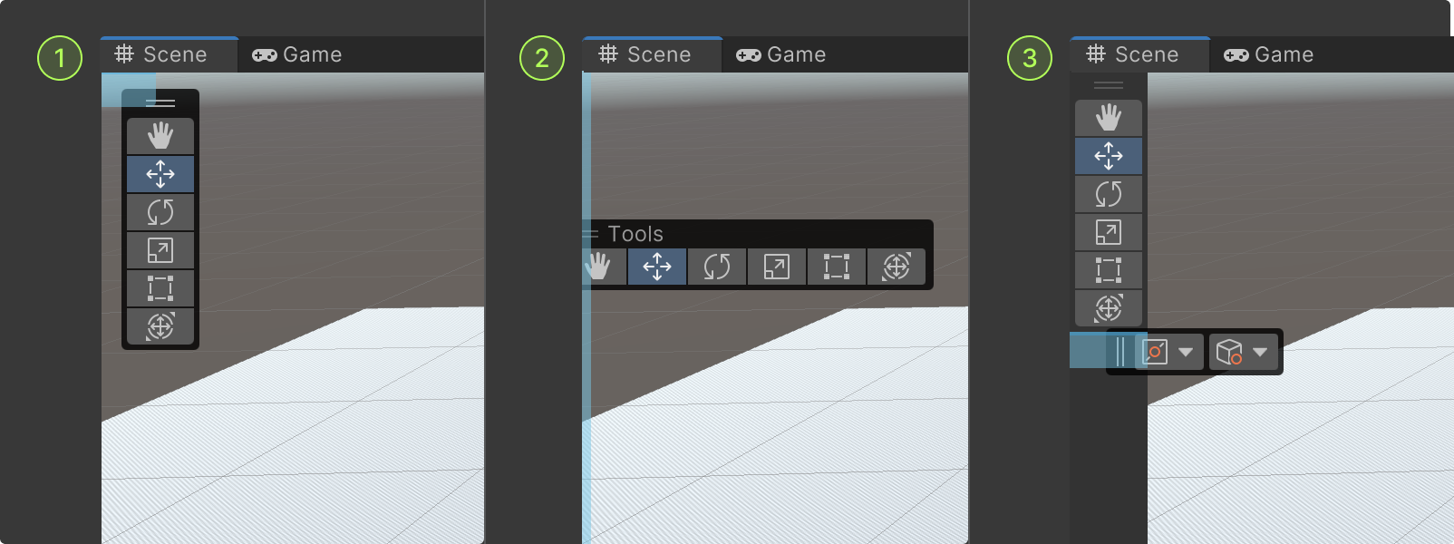
Layout modes
Overlays can be set to display in different layouts:
- Collapsed: A minimized overlay container that displays the icon (or first two letters of an overlay label), and a dropdown button to expand the overlay
- Panel: The standard overlay container that show the dragger, overlay label, and all of its content
- Vertical: A vertical overlay container that shows the dragger and overlay content
- Horizontal: A horizontal overlay container that shows the dragger and overlay content
- Horizontal toolbar: Overlays that are docked on the edges of the window appear in toolbars
Collapsed overlays when edge docking
When horizontal and vertical layouts are not defined for an overlay, it will collapse when docked on the edges of its window.
Collapsed overlay labels
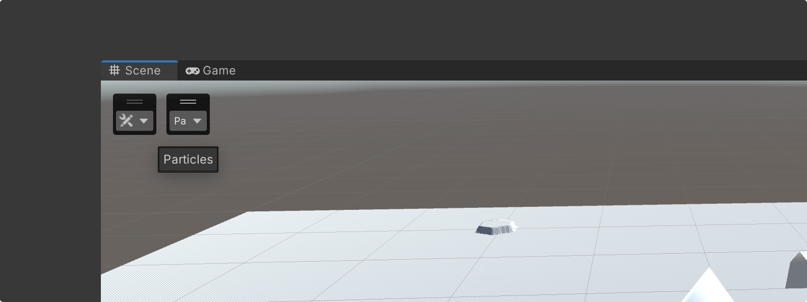
- When an overlay is collapsed, its label will be replaced by its icon
- If no icon is specified, by default the system uses the first two letters of the overlay name (or the first two initial letters of the first two words)
Style
Drop zones
Drop zones are blue areas that appear as a container is being dragged to highlight where the container can be docked and where the container was before.
- Target drop zone: While dragging a container, the target drop zone shows where the container can be docked by highlighting the target area
- Ghost drop zone: While dragging a docked container, the ghost drop zone shows where the container currently is by highlighting the shape of the container in its current location
The shapes of target and ghost drop zones are displayed differently depending on the location of the overlay container / target.
- Corner drop zone: Corner drop zones are used to highlight corners of the window where a container can be docked; they appear as a square blue layer in the corner of the container the overlay is being dragged into
- Edge drop zone: Edge drop zones are used to highlight edges of the window where a container can be docked. they appear as a thin blue layer along the edge of the container the overlay is being dragged into
- Toolbar drop zone: When a container is being dragged into a toolbar, the position of the target is highlighted within it
For more information go to drop zone color variables ->
Behavior
Overlay menus

Most overlay actions are done in the overlay menu. This menu can be accessed in two ways:
Transient state
Transient overlays are a type of overlay that is not controlled by a user, and only drawn in the active scene view when requested by the visible property.
For more information about transient states go to Unity Scripting References ->
Color variables
Container color
%90
Dragger color
Drop zone colors
Creating custom overlays
You can create custom panel overlays and toolbar overlays for your scene view window.
For a step-by-step guide on creating custom overlays go to the Unity Manual ->
Manual and code samples

