
Content Organization
Recommended ways of grouping contents that contextually belong together without creating visual clutter.
Recommended ways of grouping contents that contextually belong together without creating visual clutter.
Contents shown in the Unity Editor such as property controls can be placed across the Editor windows depending on their context, asset type, and what type of object or property they effect.
Different contexts require different tools and windows to be surfaced, and the location where the content is placed plays a crucial role in authoring workflows.
These contents can also be grouped in multiple ways such as: read-only content groups; property fields; or controls that contextually belong together.
Since the Unity Editor has a high density interface with many elements shown in the viewport at a time, it is important to group elements logically without creating visual clutter.
In order to help users parse content easily, elements on the interface can be grouped using containers, vertical spacing, altered background colors and with headers or foldouts.
.png)
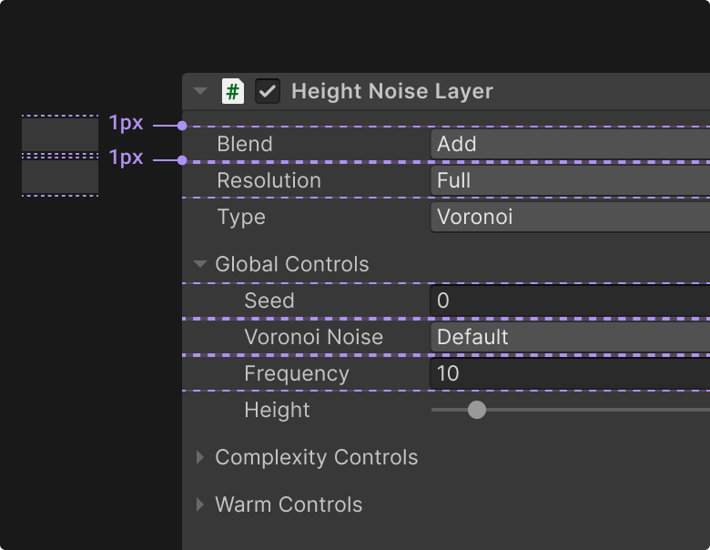
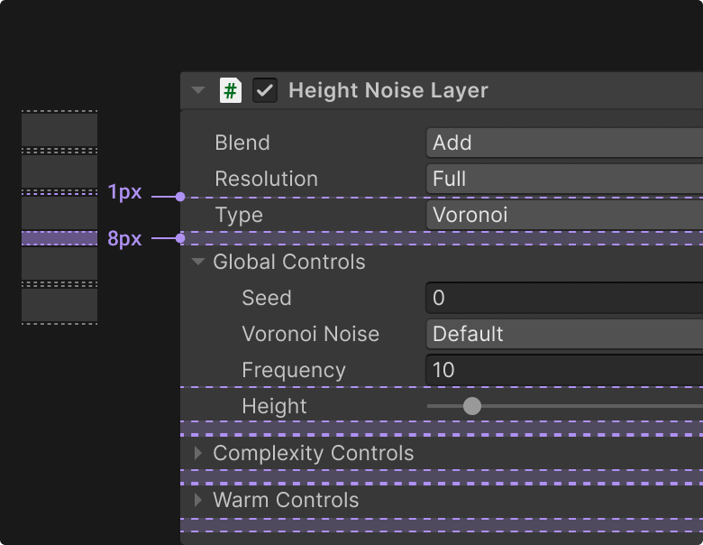
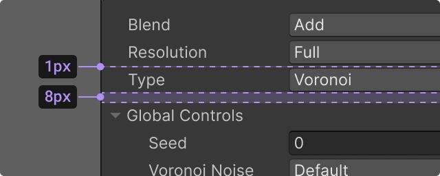
The best way to parse element groups is to simply add extra vertical spacing between them. Placing element groups in containers when it is not necessary adds visual clutter and unnecessary indentation.
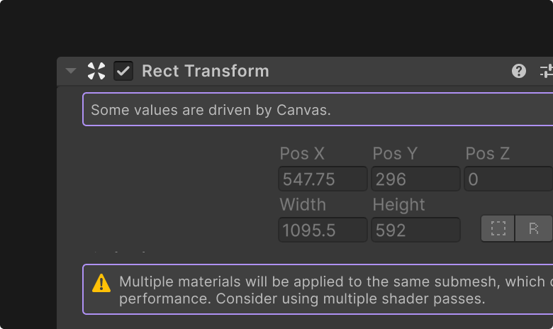
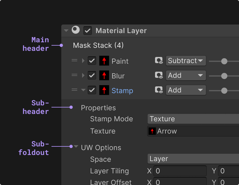
Throughout the Unity Editor, elements displayed in containers hint at interactivity, such as regular controls like buttons or dropdowns, or larger patterns such as reorderable lists, tiles, draggable elements or any grouped elements that have interactions between them.
Therefore do not use containers to group elements together if these elements do not share any interaction as a group.
Note that adding your content in containers will add a horizontal indentation to the group.
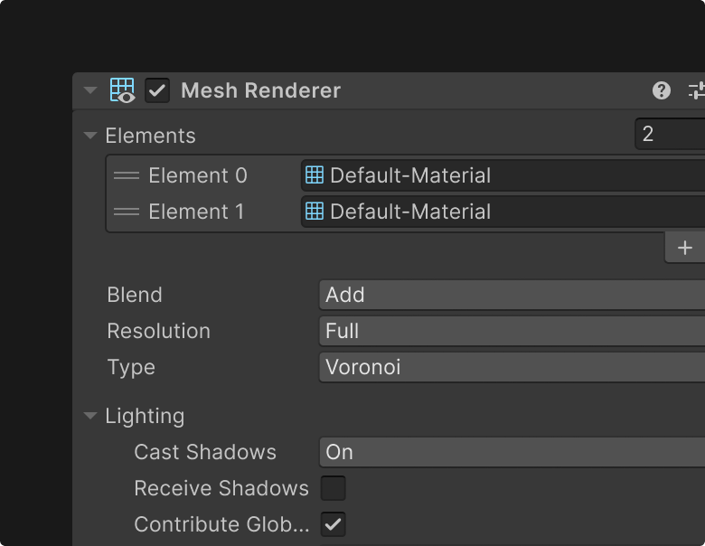
In certain cases, placing your content in a container can help users parse this content from the rest of the interface.
Temporary actions such as loading or progress content can also be displayed in a container to signify its non-persistent state.
Similar to the use of containers, altering the background color of an element, or element group should be reserved to hint interactivity, or to separate this group entirely from the rest of the interface.
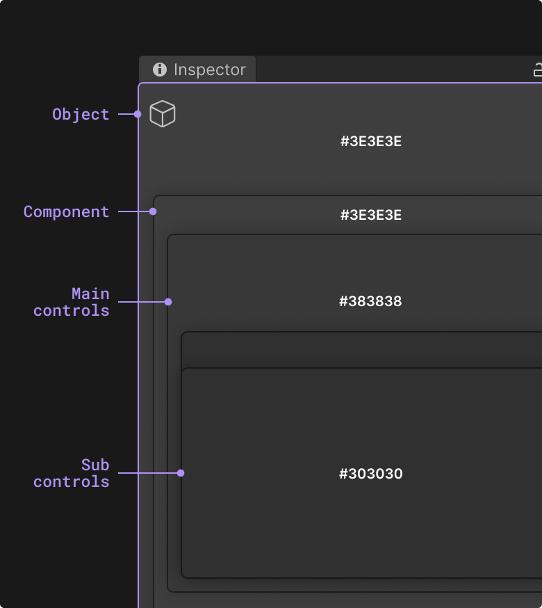
Inspector headers display the selected scene object’s global properties, such as its name, icon, and tag and layer settings. It is the highest hierarchy in the Inspector window, followed by the component headers and property controls.
The background of these interfaces are varied with lighter backgrounds to showing higher levels of hierarchy in the Inspector window.
Note: Component headers have a lighter background color both on idle and hover states, even though their interactivity is clear from having the carat icon. This is done to treat component headers as a separate higher element that groups everything under them.
Editor interface background colors get darker as content gets more detailed, going from lighter at Selected Object and Component headers, to darker for component controls and sub controls.
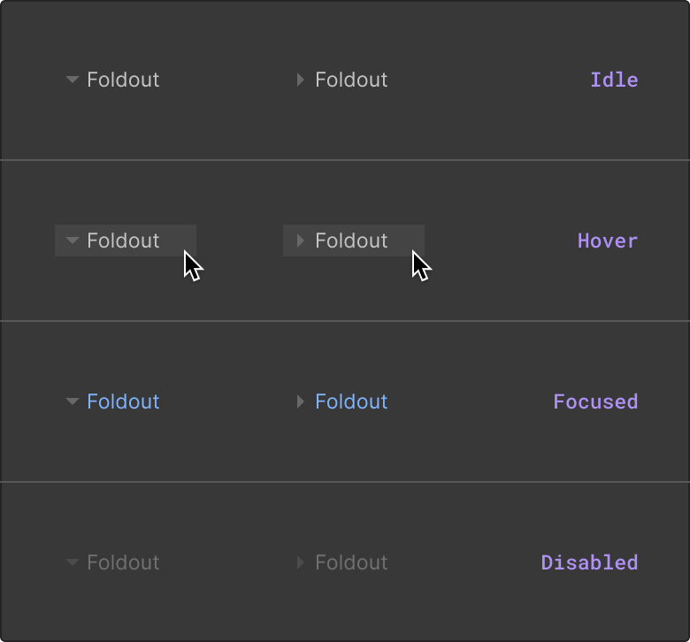
Note that the Foldout control does not have an altered background color when idle. It hints at the interaction by having the expand/collapse carat icon and lighter background color on hover.
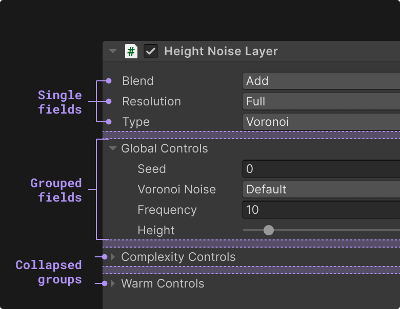
The most common way of grouping elements is to use a Label header or a Foldout control.
When grouping a larger number of property fields, using a foldout can help users keep their interface uncluttered and minimalized by collapsing the group of fields when they are not needed.
Do use headers for content that should stay visible and do not require the expand / collapse function.
Do not place foldouts / headers and their content in a container, unless the container has other functionality like reordering or adding / removing fields.
Do not add high traffic controls under foldouts in order to keep them visible at all times.
When grouping property fields that range between 2 and 5, adding a top header to this group can help users understand the grouping context.
Do use headers for content that should stay visible, and don't require expand / collapse function.
It is generally not recommended to bold a label, whether as a header or a foldout, unless it signifies something specific.
In the context of solely grouping fields, placing them under a header or foldout with left indentation, already gives the visual hint that this is a group, bolding a label will give an impression of higher significance in the interface.
Do reserve the use of bold labels for component headers and other instances where a label needs higher visibility than the rest of the labels in the same interface.
Tabs help organize and group content across segmented panels in the same viewport using a horizontal tabbed control that switches between the panels.

